GTM Charts
Steps to Plot a GTM Chart
- Access your Fullcast instance and switch plans if applicable.
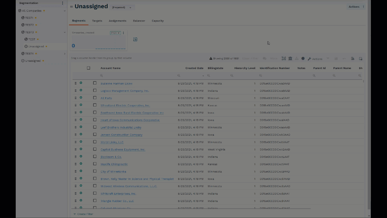
- Click on Manage Accounts on the Territories tile.
- Select the node from your hierarchy you want to create a chart for.
- Click the Actions button and select Create a Chart.
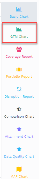
- Click GTM Chart on the right.
- Select the node from your hierarchy on which you want to create the chart.
- Now, choose the entities for which you want to plot the graph. The available entities for GTM are Assignments, Targets, and Territory.
- The Dimension is plotted on the X-Axis. Drag and drop the Dimension that you want to plot.
- The measure is plotted on the Y-Axis. Drag and drop the Measures that you want to plot.
- Set the limit for the bars. The maximum limit for the bars shown in the graph is 1000. You can adjust this value as needed.
- Drag and drop the timeline/time period field if required.
- If needed, you can create a specific report by providing appropriate filter conditions.
- Click on Plot to generate the GTM Chart.
Did this answer your question?
Thanks for the feedback
There was a problem submitting your feedback. Please try again later.
No results found