Managing Charts
You can use different functionalities available for the plotted GTM chart with the help of a number of options available in the top right corner of the graph.
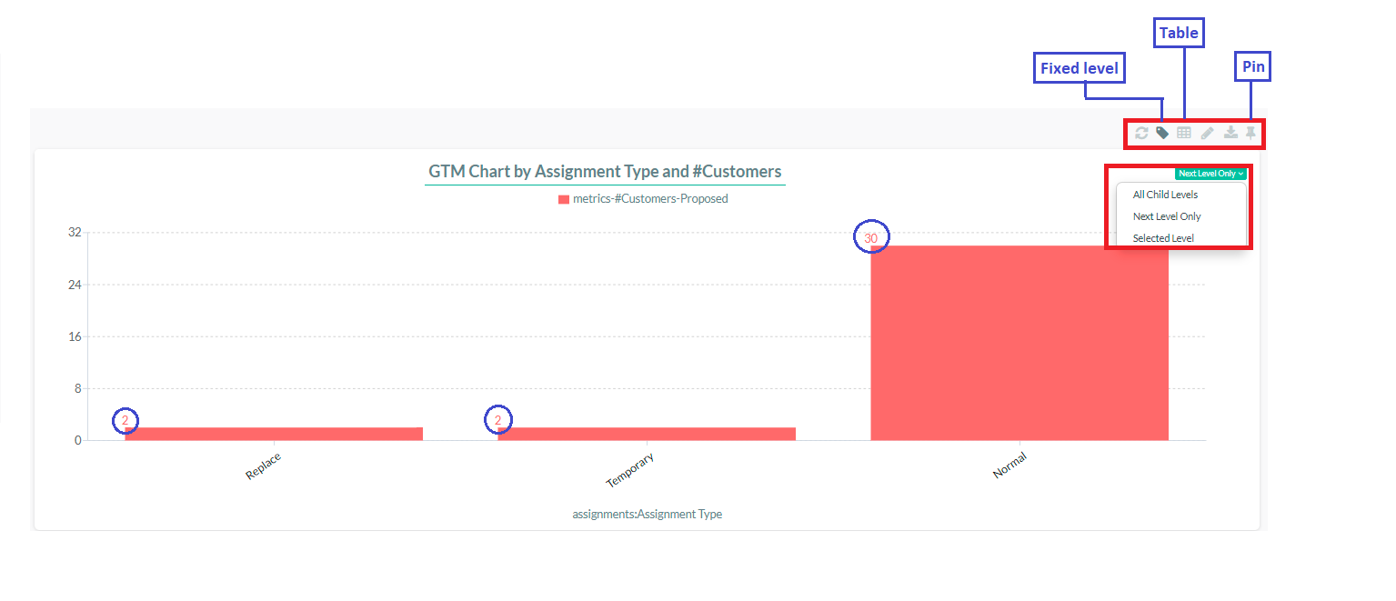
An example of a GTM Chart
To view specific values, hover over the graphs. If you wish to display the value directly within the graph, locate and select the fixed level button situated in the top right corner. Next, determine the appropriate option to plot the graph according to the desired hierarchy level. Should you prefer to view the graph in a table format, simply click on the table button.
For easy viewing and comparison with other charts, you can pin the graph to the dashboard. Follow these steps:
- Click on the "Pin Chart" button.
- A pop-up screen will appear asking for the Decision Center where the graph should be pinned. Select your choice from the dropdown menu and confirm.
- Now, you can see the chart pinned on the dashboard.
- Click on "Rhythm" and select the dashboard where you pinned the graph to view it.
- You can remove the chart from the dashboard by clicking on the three-dot button and selecting the "Remove" option.

- You can refresh, edit, and download the chart by clicking the appropriate options available.